

Learning how to pair colors in outfits is the fastest way to make everything in your closet work harder. Color pairing is the skill of choosing clothing colors that harmonize, or contrast on purpose, so every outfit looks intentional instead of accidental. You do not need design training or a perfect eye for color. A few reliable rules, one quick test before you walk out the door, and the color wheel explained in plain language will get you there.
For color theory basics, read The Spruce’s color theory guide.
This guide teaches the skill itself, not a list of garments. Once you know how colors relate to each other, you can apply the method to any closet, any budget, and any body. Whether you are dressing for the office, a dinner out, or a weekend errand run, the same framework works.
Key Takeaways
- Start with one neutral anchor (black, white, navy, camel, gray, or denim) and add color from there.
- The 3-color rule keeps outfits balanced: one main color, one supporting color, one small accent.
- Monochromatic, analogous, and complementary pairings are the three wheel formulas most people actually wear.
- Value matters more than hue: pair colors of similar lightness for harmony, and different lightness for contrast.
- Test every new combination in natural light and in a mirror photo before you leave.
What Does It Mean to Pair Colors Well?
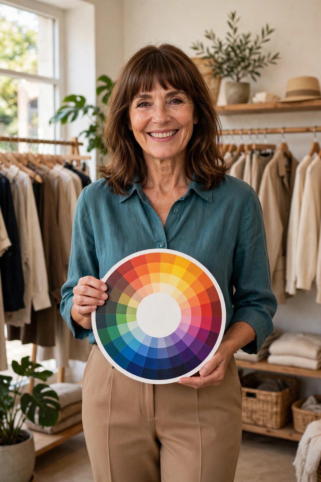
Color pairing is the deliberate matching of clothing colors using relationships from the color wheel, guided by balance and proportion of color. An outfit “works” when the colors relate to each other in a recognizable way: they are neighbors on the wheel, they sit opposite each other for contrast, or they are variations of one single hue. Random clashes happen when three or more unrelated bright colors fight for attention with no neutral to calm them down.
The good news is that color is a learnable skill, closer to cooking than to talent. Follow the recipe a few times, taste the results, and soon you will improvise without thinking.
Build Around Neutrals: Your Color Anchors
Every well-paired outfit starts with an anchor, and anchors are almost always neutrals. Black, white, cream, gray, navy, camel, brown, and washed denim are neutral because they carry little to no color charge. They go with almost everything without competing for attention, which is exactly what you want from a foundation piece.
Think of neutrals as the calm base of the outfit. Your trousers, your jacket, your everyday bag, and your most-worn shoes are usually neutrals, and that is fine. One anchor is enough for a simple outfit, and two neutrals layered together (charcoal trousers with a white shirt, camel coat over black dress) always look composed.
Neutrals also do a quiet job most people miss: they give bright colors somewhere to rest. A red top over jeans, a cobalt scarf over a gray coat, an emerald bag against a black dress, each pairing works because the neutral lets the color be the star instead of the competitor.
A note on black and brown, since this combination worries a lot of people: black and brown absolutely can work together. The trick is visible contrast, so a deep chocolate trouser with a black top can read as rich rather than muddy if the tones are clearly different and the textures are clean. When in doubt, separate black and brown with a third element, like a cream shirt between them.
Color Wheel Basics Made Wearable
The color wheel is a circle of twelve hues arranged so that relationships between colors become visual. Artists learn it in school, and wardrobe stylists use the same tool. You only need four formulas from it for daily dressing.
Monochromatic: One Color, Several Shades
Monochromatic pairing uses one hue in different lightnesses and depths. Navy trousers, a sky-blue shirt, and a cobalt scarf are a monochromatic outfit. This is the easiest formula to get right because there is nothing to clash. It also tends to look polished and elongated, which many people find flattering.
Texture is the secret weapon here. When everything is one color family, mixing fabrics, such as knit, denim, and leather, or matte and sheen, keeps the outfit from looking flat. Varying the shades matters too: head-to-toe exact-match color can look like a uniform, while a mix of light, medium, and dark versions of the same hue looks designed.
Analogous: Neighbors on the Wheel
Analogous pairing combines two or three colors that sit next to each other on the wheel: blue, teal, and green, or rust, orange, and mustard. These blends feel harmonious and calm because the eye reads them as one flowing family.
This formula is excellent for patterned pieces. A floral blouse with blush, coral, and terracotta tones already contains an analogous palette, so pulling your trousers or shoes from one of those neighboring shades creates an outfit that looks pulled together with almost no effort.
Complementary: Opposites That Energize
Complementary pairing puts two colors opposite each other on the wheel: blue and orange, purple and yellow, red and green. These pairs create the highest contrast, which reads as bold and energetic.
The most wearable version keeps one side quiet. Navy trousers with a rust top, forest green dress with tan accessories, or a mustard sweater with purple earrings give you the energy of contrast without looking loud. Avoid pairing both colors at full brightness in equal amounts, which can look harsh and costume-like.
Triadic: The Bold Third Option
Triadic pairing uses three colors evenly spaced around the wheel, like red, yellow, and blue. It is vibrant by nature and works best when two of the three are softened. A burgundy top, mustard cardigan, and denim jeans are a wearable triad because the denim (a muted blue) and the deep burgundy keep the bright mustard in check.
The Decoder: Six Pairing Formulas Compared
| Formula | How It Works on the Wheel | Vibe | Try It With |
|---|---|---|---|
| Monochromatic | One hue in lighter and darker versions | Polished, elongating, calm | Navy trousers, sky-blue shirt, cobalt scarf |
| Analogous | Two to three neighboring hues | Harmonious, soft, easy | Teal blouse, forest trousers, sage bag |
| Complementary | Two hues directly opposite each other | Bold, energetic, eye-catching | Navy dress, rust belt, tan shoes |
| Split-complementary | One hue plus the two beside its opposite | Lively but easier than full contrast | Emerald top, coral and gold accessories |
| Triadic | Three hues evenly spaced around the wheel | Creative, vibrant, statement | Burgundy top, mustard cardigan, denim jeans |
| Neutral plus accent | One or two neutrals plus one color pop | Balanced, versatile, foolproof | Gray coat, white shirt, cobalt bag |
The 3-Color Rule for Everyday Outfits

The 3-color rule is the simplest discipline in color pairing: limit your outfit to three colors maximum, where one color leads, one supports, and one accents. A common version of this is the 60-30-10 split, with sixty percent of the outfit in the main color, thirty percent in the supporting color, and ten percent in the accent. Neutrals count as colors here, which actually makes the rule easier, because a black, white, or gray base quietly fills one of your three slots.
Here is how it plays out in practice. Black trousers and a white shirt take two slots, and a terracotta scarf takes the third. Navy jeans, a cream sweater, and camel boots are another classic three. Denim jacket, black dress, gold earrings: three colors, finished look.
Patterns get special treatment under this rule. A busy print already contains multiple colors, so treat the print as your main color and pull the rest of the outfit from shades inside it. A floral dress with pink, green, and cream reads as three colors at most, and solid pink shoes or a green bag will slot right in. If your print has four or more colors, keep everything else strictly neutral so the pattern does the talking.
Value Matters More Than Hue
Two colors can be technically compatible on the wheel and still look off together. The usual culprit is value, meaning how light or dark a color is. A pale yellow and a deep purple are complementary, but the extreme lightness difference makes the combination jarring, while a golden mustard with an eggplant purple feels grounded.
The rule of thumb: pair colors of similar value when you want harmony (all soft, or all deep), and colors of clearly different value when you want contrast. Undertone matters too. Colors lean warm (yellow-based, like camel and rust) or cool (blue-based, like navy and emerald), and mixing warm and cool carelessly is a common source of that vague “something is off” feeling. When an outfit feels wrong and you cannot say why, check whether you have accidentally mixed warm and cool undertones.
Test the Combo Before You Leave
You do not need a trained eye to verify a pairing. You need thirty seconds and two quick checks.
The daylight check. Indoor lighting flatters colors it should not. Warm bathroom bulbs make everything look warmer and richer than it is, which is how you discover at noon that your “matching” blacks are actually navy and charcoal. Step into natural light, or at least look at the outfit near a window, before deciding it works.
The mirror photo test. Take a quick photo of yourself in the outfit and look at the image instead of the mirror. Cameras flatten depth and sharpen color relationships, so clashes and imbalances show up in a photo before they register in real time. If the colors fight in the photo, they will fight in person.
The squint test. Step back from the mirror and half-close your eyes. Blurring the details lets you see the outfit as blocks of color. What you want is one clear dominant block, a supporting block, and a small accent. If all three blocks are equally loud, remove or mute one of them.
The overnight rule for new combinations. When you are trying a pairing formula for the first time, plan it the night before. Fresh eyes in the morning are stricter judges, and you will have time to swap a piece instead of settling for “good enough.”
Color Pairing for Real Life: Occasions and Seasons
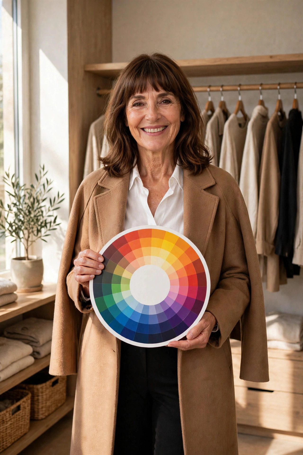
The formulas do not change by occasion, but the volume does. For the office, lean on monochromatic and neutral-plus-accent formulas, which read as competent and calm. Deep tones like navy, charcoal, and forest tend to suit professional settings. If you want inspiration for putting polished office combinations together, explore these office outfit ideas for a confidence-boosting work wardrobe.
Evening and dinner occasions welcome a little more color drama. Complementary and analogous pairings in rich shades, burgundy with forest, navy with rust, teal with camel, look intentional under evening light. For a full breakdown of after-dark dressing, these dinner outfit ideas cover everything from casual restaurants to dressy nights.
Seasonal light changes how colors read, so your palette can shift with it. Spring and summer favor lighter values and brighter hues: white, pastels, and fresh complementary pops. Fall welcomes warm, earthy combinations like rust, olive, mustard, and brown layered together, and a seasonal guide to fall dinner outfits shows how those tones work for evening plans. Winter suits deeper, cooler combinations, navy, charcoal, emerald, burgundy, often anchored with black, and these winter dinner outfit ideas demonstrate the formula in colder-weather fabrics.
For holiday dressing specifically, the classic red-and-green complementary pair is the obvious starting point, but navy and gold, emerald and cream, or burgundy and blush achieve a festive feeling without looking themed. These Christmas outfit ideas offer plenty of seasonal color inspiration, including options for women over 40 who want festive polish in flattering, sophisticated tones.
The Most Common Color Mistakes (and the Fix for Each)
- Four or more unrelated brights at once. Fix: demote one bright to an accent and push the others toward neutral or muted versions.
- All dark, no light. An all-navy, all-black, or all-brown outfit can look heavy. Fix: add one light element, a white shirt collar, a cream bag, or light shoes.
- Matching too perfectly. A top and bottom in the exact same shade of a color can read as a set, and not in a good way. Fix: use different shades of the same family, or separate the two pieces with a contrasting belt, shoe, or layer.
- Ignoring shoes and bag in the color count. Accessories are colors too. Fix: treat your bag and shoes as the third slot of the 3-color rule instead of afterthoughts.
- Warm and cool undertones fighting. Fix: hold each garment next to your face in daylight and keep the pieces that sit in the same temperature family.
- Forgetting the pattern rule. A multi-color print plus a colored top plus colored shoes is three competing statements. Fix: let the print lead and keep the rest neutral.
A Note on Closet Paralysis
Many color mistakes start before you even open the closet. Standing in front of a full wardrobe and feeling like nothing works is often a pairing problem, not a shopping problem: the pieces are fine, but no one has ever organized them by color story. If that “I have nothing to wear” feeling sounds familiar, it helps to step back and sort what you own by color family before planning anything. This guide to the nothing-to-wear feeling explains why a full closet can still feel empty and how to fix it from the inside.
Putting It All Together: Three Starter Formulas
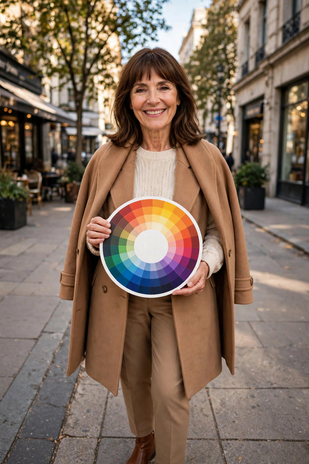
If all of this feels like a lot, memorize just three starter outfits and adapt them with whatever you own.
Formula 1: Denim plus white plus one color. Jeans, a white top, and one colored piece (jacket, scarf, or shoe) is the most forgiving outfit in existence. The denim and white are your neutral anchors, and the color gets to shine.
Formula 2: Two neutrals plus one deep color. Black trousers, a gray sweater, and a burgundy bag, or a navy skirt, a cream blouse, and forest shoes. Professional, calm, and nearly impossible to get wrong.
Formula 3: Monochrome with texture play. Camel coat, tan trousers, cream knit, brown boots. One color family, four different textures. Effortless and expensive-looking on any budget.
Each formula follows the 3-color rule, starts from neutrals, and leaves room for your own favorite hue. Master these three, then start experimenting with complementary and analogous pairings once your eye is trained.
Frequently Asked Questions
How do I know what colors match my clothes?
Start with the color wheel: colors next to each other harmonize, colors opposite each other create bold contrast, and different shades of one color always work. Then apply the 3-color rule, keeping your outfit to one main color, one supporting color, and one accent. If you are ever unsure, anchor the outfit with a neutral like black, white, navy, or camel and add color one piece at a time.
What colors go together in an outfit?
Reliable combinations include neighbors on the color wheel (blue and teal, rust and mustard), opposites used in unequal amounts (navy and rust, forest green and tan), and one hue in several shades (light blue, medium blue, navy). Neutrals pair with almost everything, and patterns already contain their own palette, so pull the rest of your outfit from shades inside the print.
How many colors should you wear in one outfit?
Three is the sweet spot for most outfits: a main color, a supporting color, and a small accent. Two-color outfits look especially clean, while four or more colors tend to compete for attention. When in doubt, drop back to two colors plus neutrals — your shoes, bag, and jacket count in the total, so include them in your planning.
Can you wear black and brown together?
Yes, black and brown can work beautifully together when there is clear contrast between the tones, such as deep black with a warm caramel brown. Keep one of them dominant, add texture (like leather or suede) to separate them, and avoid pairing mid-toned browns with black where they can look muddy.
Conclusion
How to pair colors in outfits comes down to a small set of repeatable skills: anchor with neutrals, use the color wheel’s three main formulas, keep to three colors, watch the lightness and undertone, and test the combination in daylight before you leave. None of this requires buying anything new. Open your closet, sort what you already own by color family, and try one formula this week. The more you practice, the faster the decisions become, and soon pairing colors will feel less like a rulebook and more like instinct.

Rameen Awan is the founder and editor of Outfit Algorithm, where she breaks down outfit formulas, dress codes, and styling systems for real life. Her guides focus on practical details other sites skip: fabric behavior, fit for different body types, and what actually works when you are getting dressed in a hurry.